
"Deep Inside a Real Big Empty"
A Holographic Interface for Exploring Rich Multidimensional Information


Where are We?
In the opening scene of Stephen Soandheim's musical "Sunday in the Park with George," the audience is confronted with a blank stage, a vast, white emptiness waiting to be filled with color, form, and meaning. As the scene unfolds, this emptiness is gradually transformed by the appearance of various objects - trees, animals, people - until the stage becomes a living representation of Georges Seurat's iconic painting, "A Sunday Afternoon on the Island of La Grande Jatte."
There's also a scene at the end of a MASH episode where they've just survived a perilous situation and used up all their resources. The commanding officer is sitting on the floor of a dark, empty office in front of a legless desk, talking to supply about getting his things replaced. He tells the person on the other end of the phone that he's talking to them from "deep inside a real big empty". That idea, the knee-high desk in an empty room, calls to mind the limitations of 'desktops' and 'folders' in representing the multi-dimensional connections of data and information. This process of filling the "big empty" with structure and significance serves as a powerful metaphor for how we engage with information and data in the digital age.
Where Seurat used dots of color to capture a real moment, we use data points to construct complex models and representations of the world around us. That blank stage holds infinite potential for creation, and the realm of linked data presents us with an unbounded space in which to explore and manipulate information. By understanding the dimensions of this space and the objects that populate it, we can develop new ways of interacting with data that are both intuitive and transformative.
Dimensions and Objects
When we think of a stage, we often think of it as a two-dimensional plane, a flat surface upon which actors and objects move and interact. But in the context of data visualization and manipulation, the stage becomes a multidimensional space, capable of representing complex relationships and abstractions. Each object placed on this stage, whether it's a physical entity like a tree or a person, or an abstract concept like a trend or a pattern, brings with it a multitude of dimensions and attributes.
Some of these dimensions are intrinsic to the object itself. A tree, for example, has a certain height, width, and color that are essential to its being. A person has age, weight, and countless other physical characteristics that define them as an individual. But these internal properties are only the beginning. Each object also possesses a host of external dimensions that emerge from its relationships to other entities on the stage. A tree might be taller than a person, or a person might be standing next to a dog. These relational properties add new layers of meaning and complexity to the scene.
However, even the combination of internal and external dimensions is still not enough to fully capture the significance of an object. There are hidden dimensions, patterns and connections that lie beneath the surface, waiting to be uncovered. This is where the true power of data visualization and manipulation comes into play. By exploring these hidden dimensions, we can gain new insights and perspectives that would be impossible to achieve through simple observation.
Setting the Stage
Before we can begin to explore the dimensions of data, we must first decide what types of objects to include on our stage. This process of selection is crucial, as each object we choose to represent brings with it a vast array of data and attributes. In some cases, the sheer complexity of these objects can be overwhelming, like a porcupine bristling with quills of information. To make sense of this complexity, we must carefully curate the objects we include, selecting only those that are most relevant to our goals and interests.
This process of curation is not always straightforward. It requires a deep understanding of the domain we're working in, as well as a clear vision of what we hope to achieve through our data explorations. We must ask ourselves questions like: What are the key entities and concepts in this domain? How do they relate to one another? What attributes and dimensions are most important for understanding these relationships?
Once we've selected our cast of objects, we must decide how to represent them on the stage. This involves choosing which features and attributes to display, and how to represent them visually. Should we use color to represent a certain dimension, or size? Should we arrange the objects spatially according to their relationships, or group them based on their categories? These choices are not merely aesthetic; they fundamentally shape the way we perceive and interpret the data.
Palettes and Object Manipulation
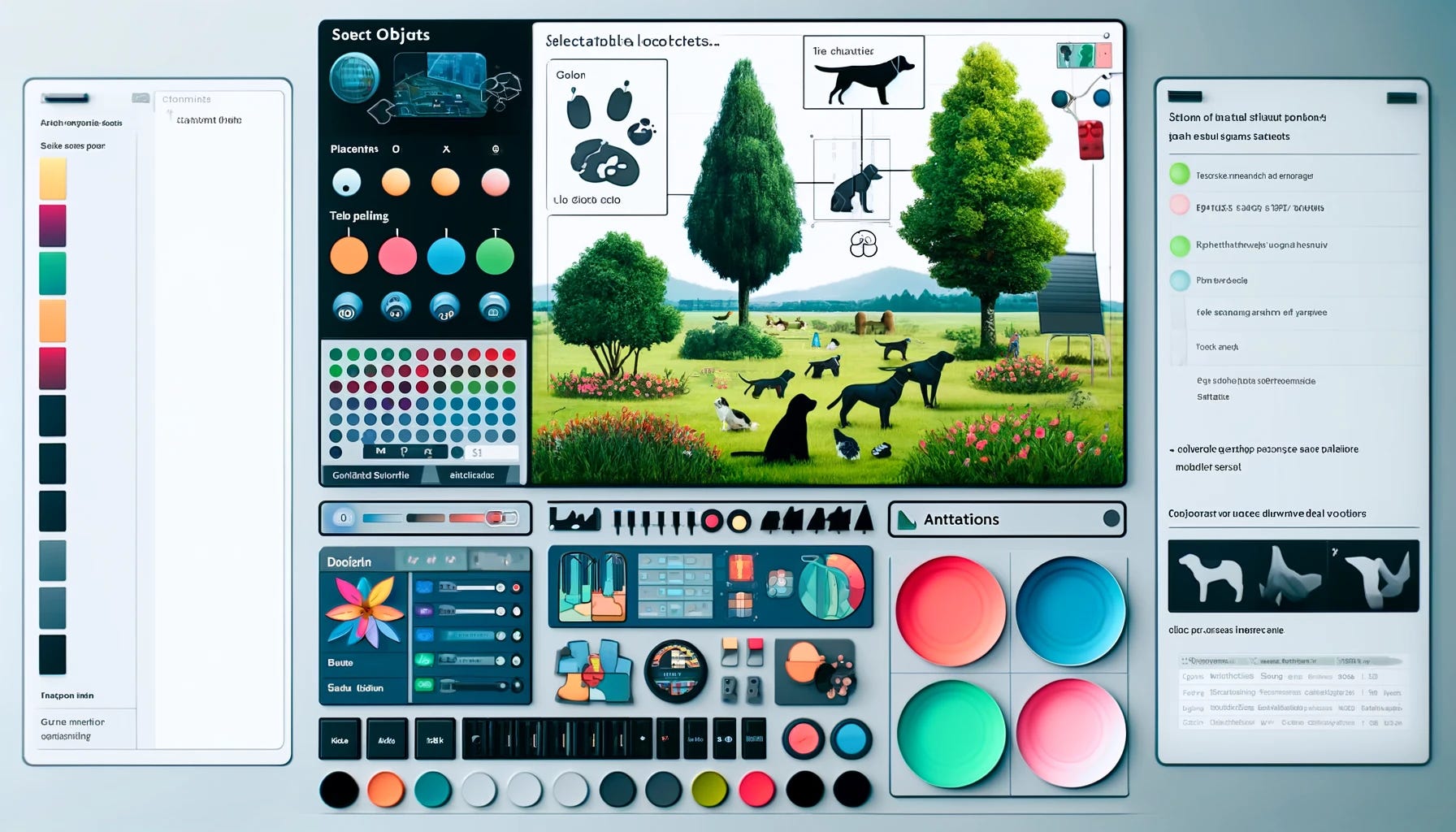
To make these choices and manipulate the objects on our stage, we can employ various interface elements and tools, much like an artist selecting brushes and colors from a palette. The object palette is one such tool, allowing us to choose the types of entities we want to include in our scene. We might select from a list of predefined objects, such as trees, buildings, or people, or we might create our own custom objects based on specific data types and attributes.
The pattern palette is another essential tool, enabling us to apply filters, groupings, and transformations to the objects on the stage. With the pattern palette, we can highlight certain attributes or dimensions, hide others, and create new derived dimensions based on calculations and comparisons. We can also apply visual encodings to the objects, changing their size, color, or shape to reflect specific data values or relationships.
By combining the object and pattern palettes, we can create rich, multidimensional representations of our data. We can combine different types of objects, investigate hidden connections and correlations, and explore the data from multiple angles and perspectives. This process of manipulation and exploration is iterative and interactive, allowing us to continuously refine our understanding and generate new insights.
Navigating Dimensions
Navigating through the multidimensional space of data can be a daunting task, especially when dealing with complex datasets and abstract concepts. To help guide us through this space, we can use the navigation palette, a set of tools and controls for mapping the dimensions of our objects to the dimensions of the stage itself.
One common approach is to assign specific attributes or dimensions to the X, Y, and Z axes of a three-dimensional coordinate system. This creates a spatial representation of the data, where each object's position reflects its values along those dimensions. We can then rotate, zoom, and pan through this space, exploring the relationships and patterns that emerge.
But the navigation palette is not limited to spatial dimensions alone. We can also map dimensions to time, creating dynamic, animated visualizations that show how objects and relationships evolve and change over time. We can map dimensions to color, size, or shape, creating visual encodings that highlight specific attributes or categories. And we can even map dimensions to sound or haptic feedback, creating multisensory experiences that engage multiple modes of perception.
By experimenting with different mappings and configurations, we can create a wide range of visualizations and interfaces, each tailored to specific tasks and datasets. The key is to find mappings that are intuitive, informative, and aesthetically compelling, allowing users to easily navigate and explore the data without becoming overwhelmed or disoriented.
Experts Share Concepts
As we learn to manipulate and explore information in its myriad dimensions, we start to develop higher-level concepts and abstractions that encapsulate multiple objects and relationships. These concepts are the building blocks of expertise, allowing us to chunk information into meaningful units and navigate the data more efficiently.
Some of these concepts may be predefined, based on existing domain knowledge or best practices. For example, in a dataset of customer purchases, we might have predefined concepts like "high-value customer," "repeat buyer," or "churn risk." These concepts provide a starting point for exploration and analysis, guiding us towards the most relevant and actionable insights.
Other concepts may emerge organically as we explore the data, revealing novel patterns and relationships that we hadn't anticipated. For example, we might discover that customers who buy a certain product tend to also have a high lifetime value, or that certain demographics are more likely to respond to specific marketing campaigns. These unnamed concepts can be captured and reused, becoming part of our evolving understanding of the domain.
As we develop more concepts and refine our understanding, we are able to see the data in new ways. We can spot anomalies and outliers more easily, identify trends and opportunities more quickly, and make predictions and decisions with greater confidence. This process of concept formation and refinement is the essence of expertise, allowing us to move beyond surface-level observations and gain deep, meaningful insights.

Assistive Models and Machine Learning
While human insight and expertise are essential for making sense of data, we can also leverage the power of machine learning and artificial intelligence to assist us in the process. Assistive models, powered by techniques like clustering, classification, and principal component analysis, can help guide us towards the most relevant and informative dimensions and concepts.
These models can analyze data in near real-time to illuminate patterns and relationships that might be difficult or impossible for humans to discern. They can suggest new dimensions to explore, highlight potential outliers or anomalies, and even generate novel concepts and categories based on the underlying structure of the data.
It's important to note that these models are not a replacement for human expertise, but rather a complement to it. The insights generated by machine learning should be viewed as suggestions and prompts, inviting us to explore further and validate the findings through our own domain knowledge and intuition. In order to do all that, though, we must be able to use them and adjust them and build with them.
One way to achieve this balance is through the use of interactive, visual interfaces that allow us to see the output of multiple models in context, and to manipulate and refine the suggestions as needed. For example, a clustering algorithm might suggest a set of customer segments based on purchase history and demographics, but a human expert might recognize that some of these segments are not actionable or relevant for the business. By adjusting the parameters of the model or selecting different dimensions to include, the expert can refine the segmentation to better align with their goals and strategies.
Dimensional Flexibility
One of the key strengths of a multidimensional approach to data visualization and manipulation is its flexibility. By representing data as objects with multiple dimensions, we can create a wide range of scenes and interfaces, tailored to specific tasks and contexts.
At the most basic level, we can use the same data to generate simple tables and graphs, presenting the information in a clear and concise format for reporting or communication purposes. But we can also create more complex, interactive visualizations that allow users to explore the data in depth, uncovering hidden patterns and insights.
For example, we might create a three-dimensional scatter plot that shows the relationship between customer age, income, and purchase frequency. By rotating and zooming through this space, we can identify clusters of customers with similar characteristics, and explore how these clusters differ along other dimensions like product preferences or marketing responsiveness.
Or we might create a network graph that shows the connections between different products based on customer co-purchase patterns. By filtering and highlighting specific nodes and edges, we can uncover important influencers and bridge products that drive cross-selling and upselling opportunities.
The key is to create visualizations that are not only informative, but also engaging and intuitive. By leveraging the natural human capacity for pattern recognition and spatial reasoning, we can create interfaces that feel natural and effortless to navigate, even when dealing with complex, high-dimensional data.
Surfaces and Essences
As we navigate through the multidimensional space of data, it's important to remember that what we see on the surface - the colors, shapes, and patterns of the visualization - is only a reflection of the underlying essence of the data. To truly understand and make use of the information, we must look beyond the superficial and dig deeper into the fundamental structures and relationships.
This is where the concept of "surfaces and essences" comes into play. The surface of a data object is made up of its visible attributes and dimensions - the things we can see and manipulate directly in the visualization. But the essence of the object lies in its hidden connections and patterns, the underlying rules and principles that give rise to its behavior and characteristics.
To uncover this essence, we must engage in a process of exploration and experimentation, using the tools and techniques of data manipulation to test hypotheses and validate insights. We must look for the invariances and symmetries that hold across different dimensions and contexts, the fundamental laws and relationships that govern the behavior of the system.
This process of making the essence visible at the surface is the hallmark of expertise, and it's what allows us to make accurate predictions, uncover novel insights, and develop robust, actionable strategies. It requires trial and error and improvisation, but it's an essential part of the data exploration process.

Human Problem Solving
As powerful as data visualization and manipulation tools can be, it's important to remember that they are ultimately in the service of human understanding. The goal is not simply to create pretty pictures or impressive animations, but to help people make better decisions, solve complex problems, and gain new insights into the world around them.
To achieve this, we must design our tools and interfaces in a way that aligns with the natural properties of information and processes of human cognition and problem solving. This means understanding how people perceive and interact with visual information, how they form concepts and mental models, and how they reason and make decisions under uncertainty.
One key insight from cognitive science is that humans rarely solve problems through brute-force calculation or exhaustive search. Instead, we rely on analogies, approximations, and pattern matching to quickly identify promising solutions and eliminate dead ends. We chunk problems into smaller, more manageable pieces, and we map new situations onto familiar ones.
By designing our data interfaces to support these natural problem-solving strategies, we can create tools that are more intuitive, efficient, and effective. This might involve providing multiple views and perspectives on the data, allowing users to switch between different levels of abstraction and detail. It might involve using visual metaphors and analogies to help users map the data onto familiar concepts and experiences. And it might involve providing interactive feedback and guidance, helping users to refine their queries and hypotheses as they explore the data.
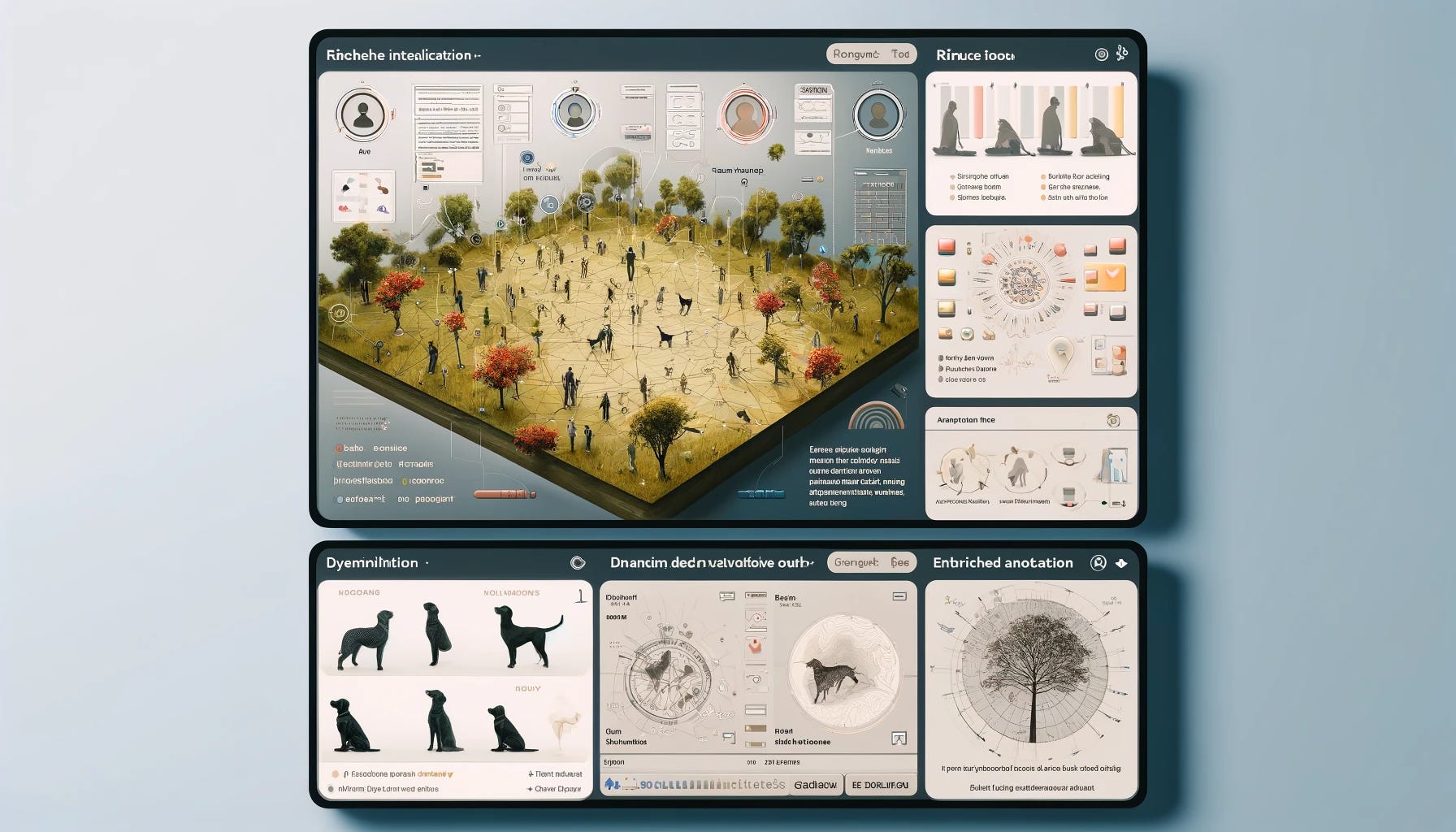
The Holographic Interface
Ultimately, the goal of a multidimensional approach to data visualization and manipulation is to create what we might call a "holographic interface" - a representation of the data that is as integrated and connected as the data itself. It may be simple and geometric or so rich, vivid, and immersive that it feels almost tangible, like a physical object that can be explored and manipulated from any angle.
This holographic interface would be built on a foundation of linked, machine-readable data, organized into objects, attributes, and relationships. But it would be brought to life through techniques of visualization and interaction, allowing users to navigate and explore the data in fluent, intuitive ways.
Imagine being able to walk through a three-dimensional landscape of customer data, where each customer is represented as a unique object with its own shape, color, and texture. Imagine being able to zoom in and out of this landscape, uncovering new patterns and relationships at different scales and resolutions. Imagine being able to manipulate the objects directly, combining them into new configurations or splitting them apart to reveal their inner workings.
This is the promise of the holographic interface - a way of interacting with data that is so intuitive and immersive that it feels like an extension of our own minds. By leveraging the power of machine learning and artificial intelligence, we can create interfaces that adapt and evolve alongside us, growing more sophisticated and insightful with each interaction.

A New Kind of Literacy
By embracing a multidimensional approach, we open up new possibilities for insight and discovery. The process of exploring and understanding data is ultimately a creative act. We can use data visualization and manipulation to create new ways of understanding and interacting with systems around us, uncover hidden patterns and relationships, explore alternative perspectives and hypotheses, and gain a deeper understanding of the fundamental structures and principles that underlie the data.
But at its heart this is about the human experience of engaging with information. It's about creating interfaces and interactions that are intuitive, engaging, and meaningful, that allow us to explore and manipulate the data in ways that align with our natural cognitive processes and problem-solving strategies.
The holographic interface, with its ability to create rich, immersive, and tangible representations of data, makes it possible for us to put ourselves inside complex systems and investigate them the way we explore our own world. Further, by combining the power of machine learning and artificial intelligence with the creativity and insight of human perception and cognition, we can create data experiences that are truly transformative.
Ultimately, the goal is not just to make data more accessible or more visually appealing, but to change the way we think about data altogether. We need to create a new kind of literacy, a new way of seeing and interacting with the world that is grounded in the principles of exploration, experimentation, and discovery.